Module: Editor
Version: 4.4.10 +
User: Developer
Level: Advanced
Introduction
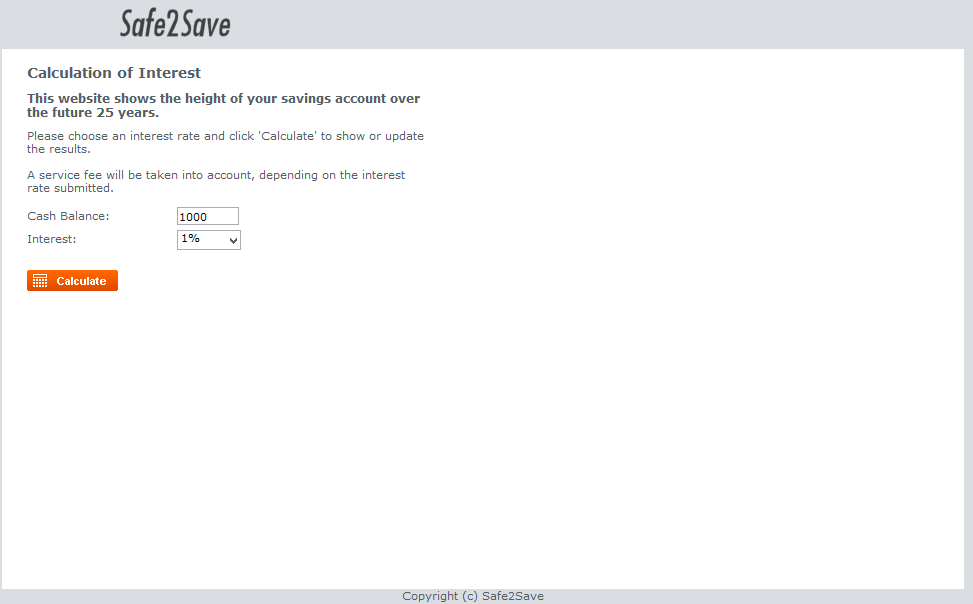
In this tutorial we will show the principle of responsive design, using the Safe2Save example of the Beginners tutorials.
Prerequisites
- The Futurama Editor must be installed.
- A Text-editor (e.g. Notepadd++) must be installed.
- Download the safe2save website and install it in the inetpub folder on your computer. ( See description )
- Mobile phone or mobile phone emulator ( Opera mobile emulator ) that is able to connect to the safe2save website.
Description
Nowadays there are a lot of different devices which people use to connect to the internet. For developers, this can be challenging, as you want your website to look good on each different platform. When people visit a desktop website on a mobile device, they can be overwhelmed by the amount of information that is displayed on a small screen, in a user unfriendly way.
One option for this would be to develop a whole new application for mobile devices. However, this would make your functionality less easily maintainable, as you'd have to implement each new or improved feature twice from that point on.
Our solution to support different devices therefore is 'responsive design'. With responsive design the layout of a website is adapted depending on the size or characteristics of the visitor's device. You could also differentiate in functionalities between for instance mobile and desktop devices. For example:
On a mobile website, you prefer to have a small header and footer so that the center of the site is able to contain most of the information the visitor requests. On the desktop website, you prefer to have a large header, because this also contains for instance a picture and menu.
In this tutorial we will show the basics of how you can create a basic Futurama application responsive. We will use the end result of the Beginners tutorial website, and make this website easy accessible for both mobile and desktop devices. Therefore, you should download the Safe2Save website endresult, and install it, to be able to complete this tutorial.
Because there are several subjects that need to be discussed, this tutorial is divided into three chapters.
- Webpage with two responsive webpanels
- Include header tags
- CSS - How to apply CSS on different screen sizes
1. Webpage with two responsive webpanels
This first part will show you how responsive webpanels can be made in Futurama depending on the visitors useragent.
The useragent contains information about the visitors browser, operating system and type of device.
Note(1): If you are using the Opera mobile emulator, we recommend to test your results in the Samsung Galaxy S3. Our results and screenshots are based on this configuration. Your results may diverge if you're working in a different way.
Note(2): Add a bookmark to the mobile emulator and your browser. This makes it easier to test your results.
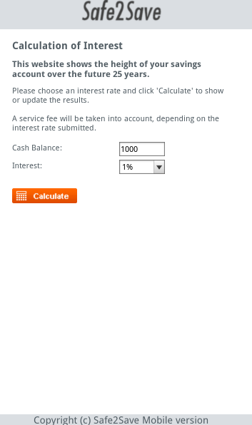
Website path: http://localhost/[Save2Safe website folder]/default.aspx?folder=SavingsAccount
First, we want to create different webpanels to be able to have different functionality for mobile and desktop.
- Open the website.xml from the folder; (C:\inetpub\wwwroot\Safe2Save_Websites) \SavingsAccount in the Futurama Editor.
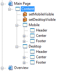
- Create 2 new webpanels in Main Page/Content; Mobile and Desktop
- Copy the rest of the content in Main Page/Content and paste them in both Mobile and Desktop ( Header, Center and Footer )
- Delete the copied files in Main Page/Content ( Header, Center and Footer )
- Check if your references are still ok. In Center/Left/Calculate/Set Visible, the TargetControl link could be broken because of the copy execution. Make sure the TargetControl refers to the Right Panel below. (This malfunctioning could have been prevented by using a relative path in the reference)
- Create 2 actions in Main Page/Content; setMobileVisible and setDesktopVisible.
- Select setMobileVisible and open the property TargetControl in the properties window.
- Click on new and select the webpanel named: Main Page/Content/Mobile
- Repeat step 7 and 8 with setDesktopVisible and set the TargetControl to Main Page/Content/Desktop and put the Actions above the Mobile and Desktop webpanel, in the tree structure of the Document.
We now have 2 sections, intended for mobile or desktop usage.
Note: You can subdivide between mobile and desktop device on any level in your treestructure. If difference are small, you will to subdivide on a lower level, so a lot of the content will be shared. You can also use references to still share content when you are within a specific platform implementation.
In this example we will only introduce a small difference in the footer of the website. This is just so show the functionality. For this example only, it wouldn't have been necessary to create two copies of the entire content (it's even inefficient).
We will now create the formulas needed to detect which device you are using.
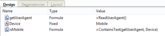
- Create a new Node in your SavingsAccount - Website application, named 'Device detection'
- Within this Node, create a formula 'getUserAgent'. Change the type of this formula to String and open the text property.
- Select a formula; Document -> ReadUserAgent and click OK
- Within the same node, create a fixed string named Device
- Open the Text property and type 'Mobile' when your testing on a mobile phone. If your testing on Opera Mobile Emulator, type 'Android'. Click on OK.
Note: this Fixed should contain a text that will surely be contained in the user agent text description of the device(s) you want your website to vary on.
- Now create a boolean formula 'isMobile', again in the Node 'Device Detection'
- Select a formula; Text -> ContainsText
- Add a reference in the Text property to /SavingsAccount - Website/Device detection/getUserAgent
- Add a reference in the Lookup_text property to /SavingsAccount - Website/Device detection/Device and click OK

We are now able to detect what kind of device is visiting the website. With this, we can show either the desktop webpanel or the mobile webpanel:
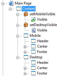
- Create a reference in Main Page/Content/setMobileVisible and name it 'Visible'. This is a reference to SavingsAccount - Website/Device detection/isMobile
- Create a boolean formula in Main Page/Content/setDesktopVisible, name it 'Visible' as well and open the text property
- Select a formula; Logical -> Not and add a reference to Main Page/Content/setMobileVisible/Visible
- We have now made the webpage a little more responsive in Futurama. To see this, in the mobile panel, change the text in the weblabel named Copyright ( Main Page/Content/Mobile/Footer ) to "Copyright (c) Safe2Save Mobile version"
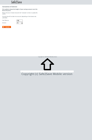
Try now to visit the website with a desktop and a mobile device. The footer on the desktop contains "Copyright (c) Safe2Save" while the footer on a mobile device contains "Copyright (c) Safe2Save Mobile version".
Desktop:
Mobile:
2. Include header tags
Because of the small screen sizes for mobile phones, header tags can be included which will zoom in on the website. These header tags are applied to the website before the content is loaded. In the example below, jQuery ( JavaScript library ) is used to apply the code to the
section of the webpage. The content of the webpages are then easier to read and the website is more mobile-friendly. The visitor doesn't have to manually zoom in anymore.
- Add an HTMLInclude element to the top of the webpanel: Main Page/Content/Mobile and name it Viewpoint
- Open the dialog box from the HTMLCode property in the properties window.
- Add the following code in the dialogbox:
In this example a JavaScript file(viewpoint.js) from the location SavingsAccount/scripts/ will be loaded in the webpanel.
The next step is to create the JavaScript file.
- Navigate to the following path in windows explorer; (C:\inetpub\wwwroot\Safe2Save_Websites) \SavingsAccount and create a new folder named scripts
- Open your text editor (Notepad++) and create a new file.
- Save this empty file as JavaScript (*.js), name it viewpoint and save it to the directory you created in step 4.
- Open the Viewpoint JavaScript file in Notepadd++ and add the following code:
$('head').append(' ');
$('head').append('');
$('head').append(' ');
$('head').append(' ');
- Save the file and open the website in a mobile browser
Now look at the mobile website and notice how the screen has changed after applying this code.
For more information about viewport check: http://www.w3.org/TR/css-device-adapt/#the-viewport-rule
3. CSS - How to apply CSS on different screen sizes
In this chapter we'll explain how to apply CSS on different screen sizes.
The best way to accomplish this is by using media queries. This is a feature of CSS3 so before you start to include this into your website, keep in mind that older browsers don't support this feature.
We'll now apply basic media queries to the save2safe website:
- Open the style sheet file named content.css in (C:\inetpub\wwwroot) \Safe2Save_Websites\SavingsAccount
- Scroll to the bottom of the file and add the following rule:
@media only screen and (max-width: 640px) {
}
The content overwrites or adds CSS for devices which have a maximum screen width of 640 pixels.
Because the letters are falling of the screen on the right side, we'll add some CSS to make the left div smaller.
- Add the following code inside the brackets of the media screen that is created in step 2:
.left{
margin-left: 20px;
width: 300px;
}
After saving this file you will see that the style sheet is only applied to devices with a maximum screen width of 640 pixels. There is less whitespace on the left of the screen and the words are getting wrapped so it fits into the screen.
A couple of rules can be added like step 3 to make the safe2save website even more mobile friendly:
.output_future{
margin-bottom:5px;
}
.navigation{
position: static;
bottom:0px;
right:0px;
}
.right{
float:left;
}
.content{
width:100%;
margin:10px auto;
}
.overview, .results{
width:200px;
}
.copyright{
width:200px;
margin-left:50px;
font-size: 14px;
}
Copy this into your CSS file and notice the difference before and after. We recommend to inspect each div element that is added into the media query so that you will understand how to use them.
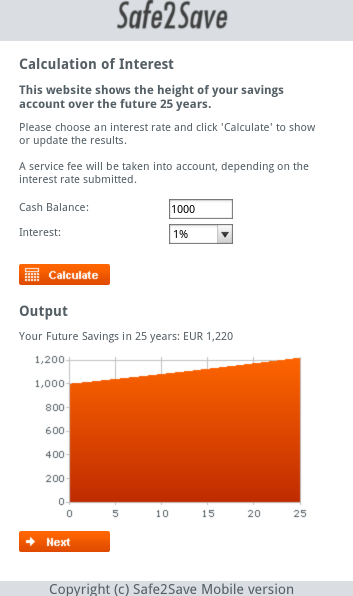
- The graph may not fit in your mobile screen or the graph is to small for your designated device screen size. Therefore you could alter the height and width of the graph in the mobile section. In the Futurama Editor, go to: Main Page/Content/Mobile/Center/Right/ and select Graph. Change the height and width of the graph in the Properties window to: Height = 180px , Width=300px
Desktop:

Mobile:
Note: In this example there is only 1 targeted screen size ( All devices that have a maximum screen width of 640px ). It is recommended to target multiple screen sizes like this:
@media only screen and (min-width: 300px) and (max-width: 480px) {
/* Your CSS for device with maximum size of 480px */
}

@media only screen and (min-width: 481px) and (max-width: 640px) {
/* Your CSS for device with a minimal size of 480px and a maximum size of 640px */
}

@media only screen and (min-width: 641px) {
/* Your CSS for device with a minimal size of 641px */
}
With this you always have the right CSS rules for the designated device.
For more information about media queries you can consult http://www.w3.org/TR/css3-mediaqueries/.
We have now shown the basic steps to make a website responsive. Of course this is only the basis, there are still a lot of improvements that can be made. For instance:
- We now have copied the entire content of the application in both a mobile and a desktop version. This means there's still a lot of double work when general changes have to be made. To prevent this double maintenance, you should use references for items that are not device dependent. For instance, as the content of the 'Left' panel in Futurama is exactly the same in both the mobile and desktop version, you should create it only once, and refer to it in the second version.
Download solution
You can download our solution for this tutorial by clicking the image at the right. (Futurama 4.4.10)