Module: Editor
Version: 4.4.10 +
User: Developer
Difficulty: Easy
Introduction
In this exercise we will show you how to let the Safe2Save website adjust itself when the orientation of the telephone is turned into landscape modus.
Prerequisites
- The Futurama Editor must be installed.
- Completing the tutorial Responsive website first, is recommended.
- We recommend you to test in Opera mobile emulator
Description
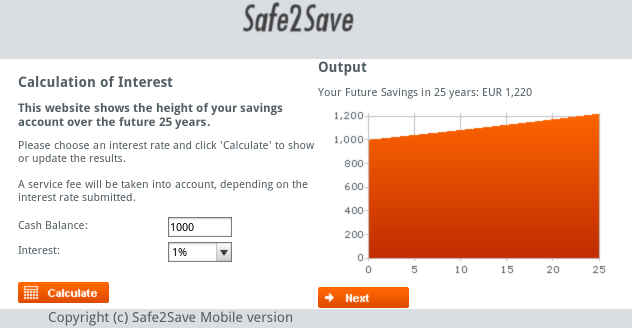
Because a device can be turned into a different orientation, we want to make sure that the website is still adapted well to the screen size of the device. When the device is turned into the landscape orientation, the Graph is shown out of the screen. In this exercise we create a different website layout for a landscape oriented device.
Assignment
Make sure that the landscape orientation is supported. The Graph that is now displayed below the Calculate button can be positioned on the right of the screen. Now the visitor doesn't have to scroll down and everything is displayed on the screen. For this example, try to use the Samsung Galaxy S3 from the Opera mobile emulator and try to accomplish this:
@media only screen  and (max-width: 640px) {
.left{
margin-left: 20px;
width: 300px;
}
Solutions
Answers
Add in the CSS file ( For devices with a max-width: 640px ):
@media only screen and (max-width: 640px) and (orientation : landscape) {
.right{
float:none;
}
.center{
height:250px;
}
.header{
margin-left: 20%;
}
.graphic{
width: 300px;
height: 180px;
}
.copyright{
margin-left:30%;
font-size: 14px;
}
}
Download

You can download our solution for this assignment by clicking the image at the right. (Futurama 4.4.10)
Please note that you can very well have a different solution that is just as good as ours.
Related Topics
- Responsive website: Futurama website tutorials.
- Exercise 2 - Target different screen sizes : Second exercise responsive website.
2013-07-08